Zeit New Brand Identity
Zeit is a software consulting company based in Denmark that focuses on iOS development and Ruby on Rails.
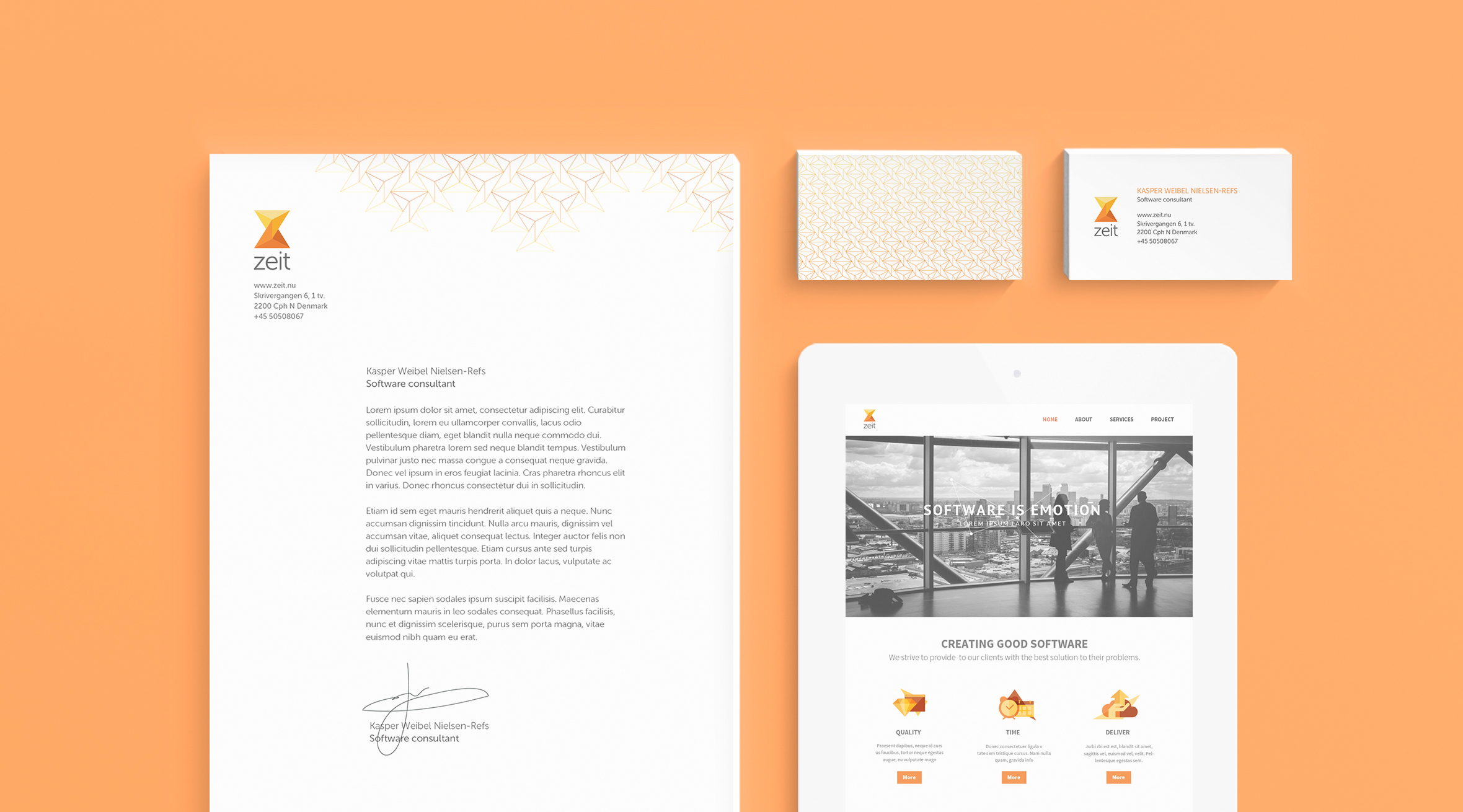
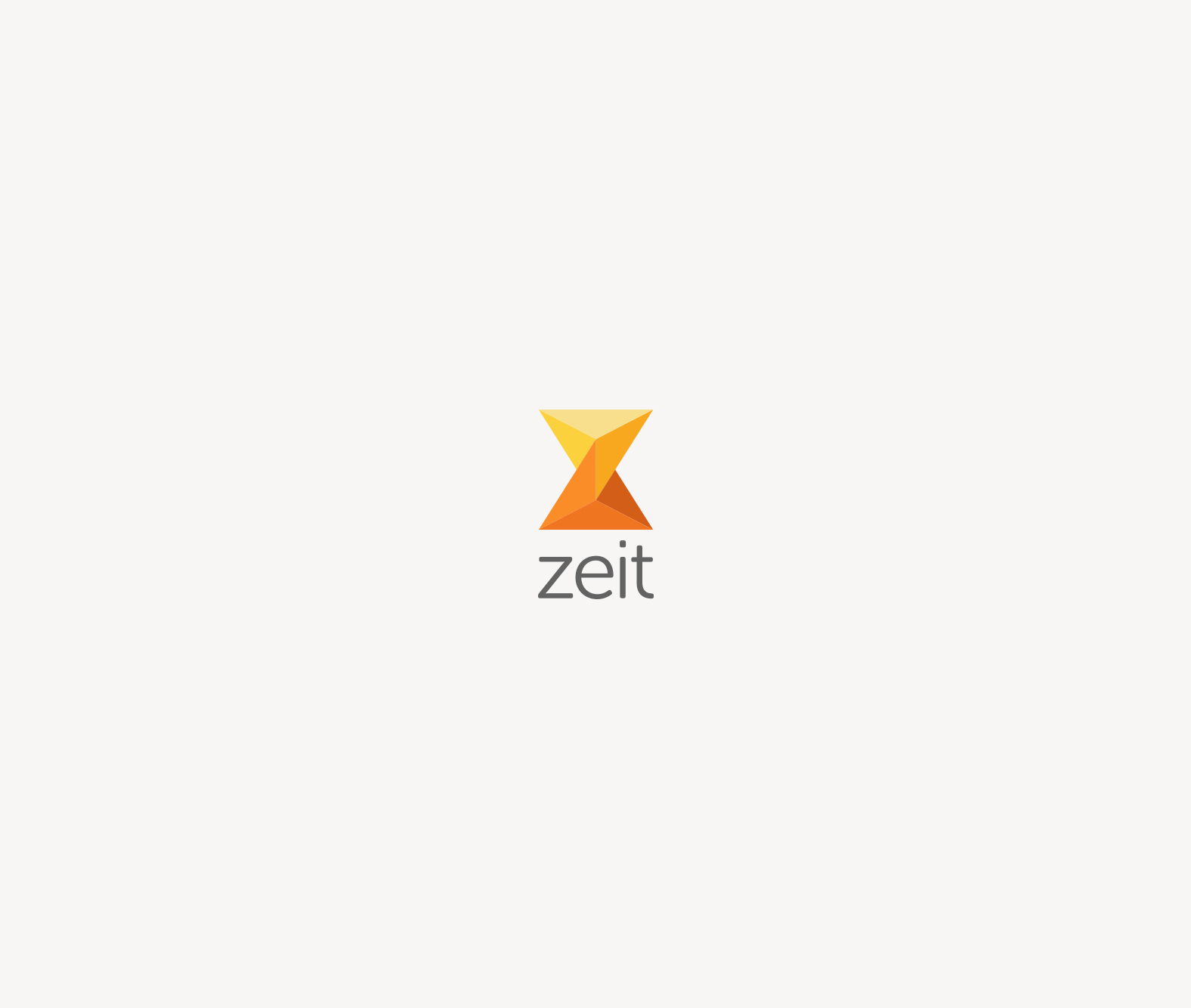
Kasper, the founder, wanted a new brand identity to communicate that more than just software, they strive to provide their clients the best solution that will fit their needs. Zeit means “time” in German and as our goal was to help them to communicate that they are both a technical and empathic human resource, we decided to use as a base a very strong and iconic symbol: the hourglass. We think it is as visual representation of time that is more human and reflects clearly the craftsmanship side of software development.
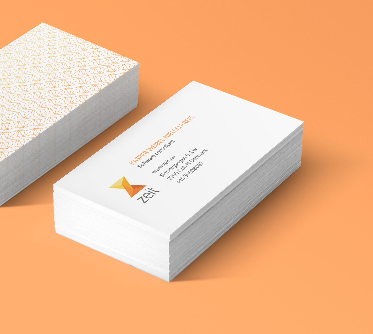
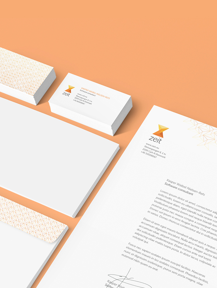
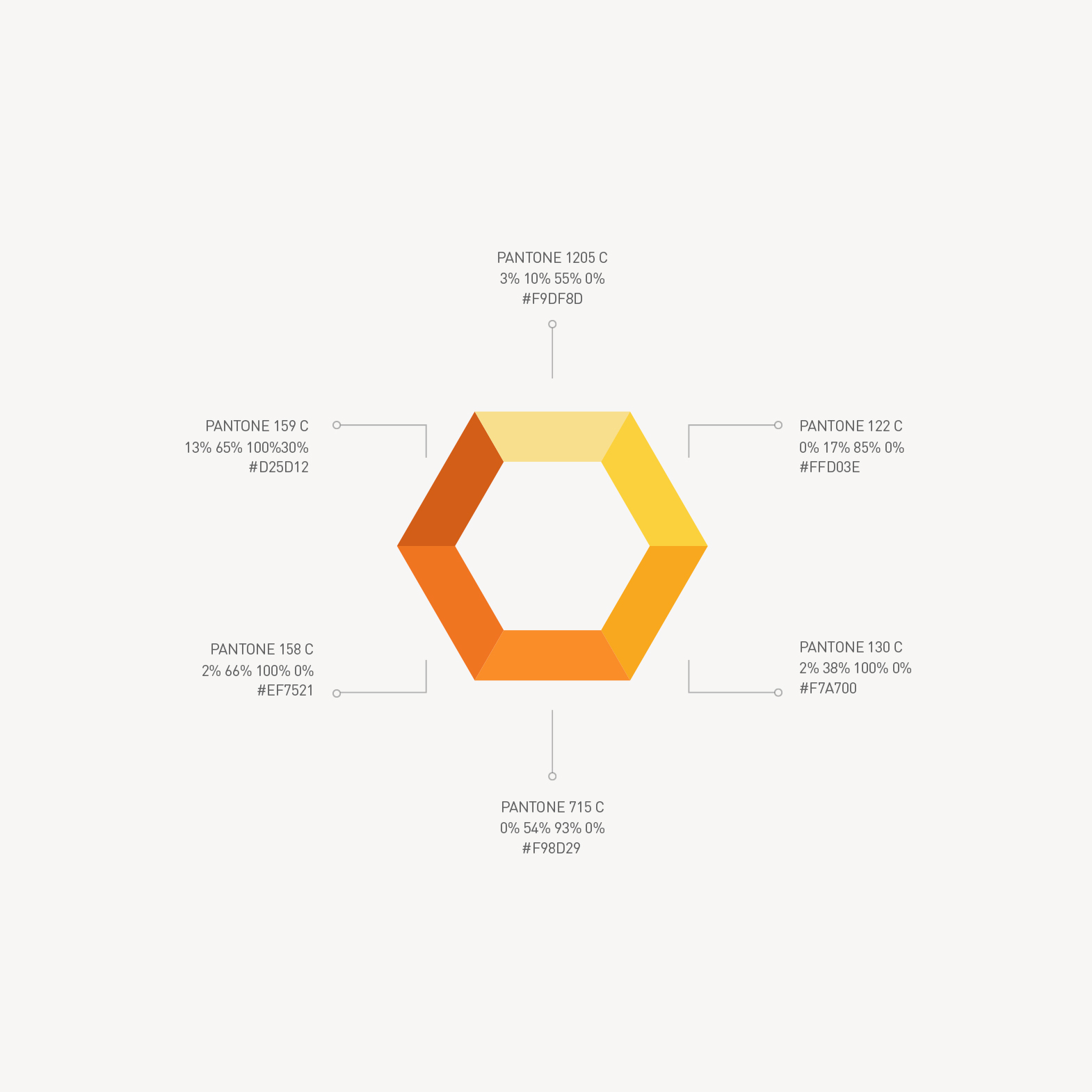
The mark draws inspiration from the shape of an hourglass, representing the time, the delicate cuts of a gemstone, that represent the craftsmanship both on top of the shape of a capital Z.
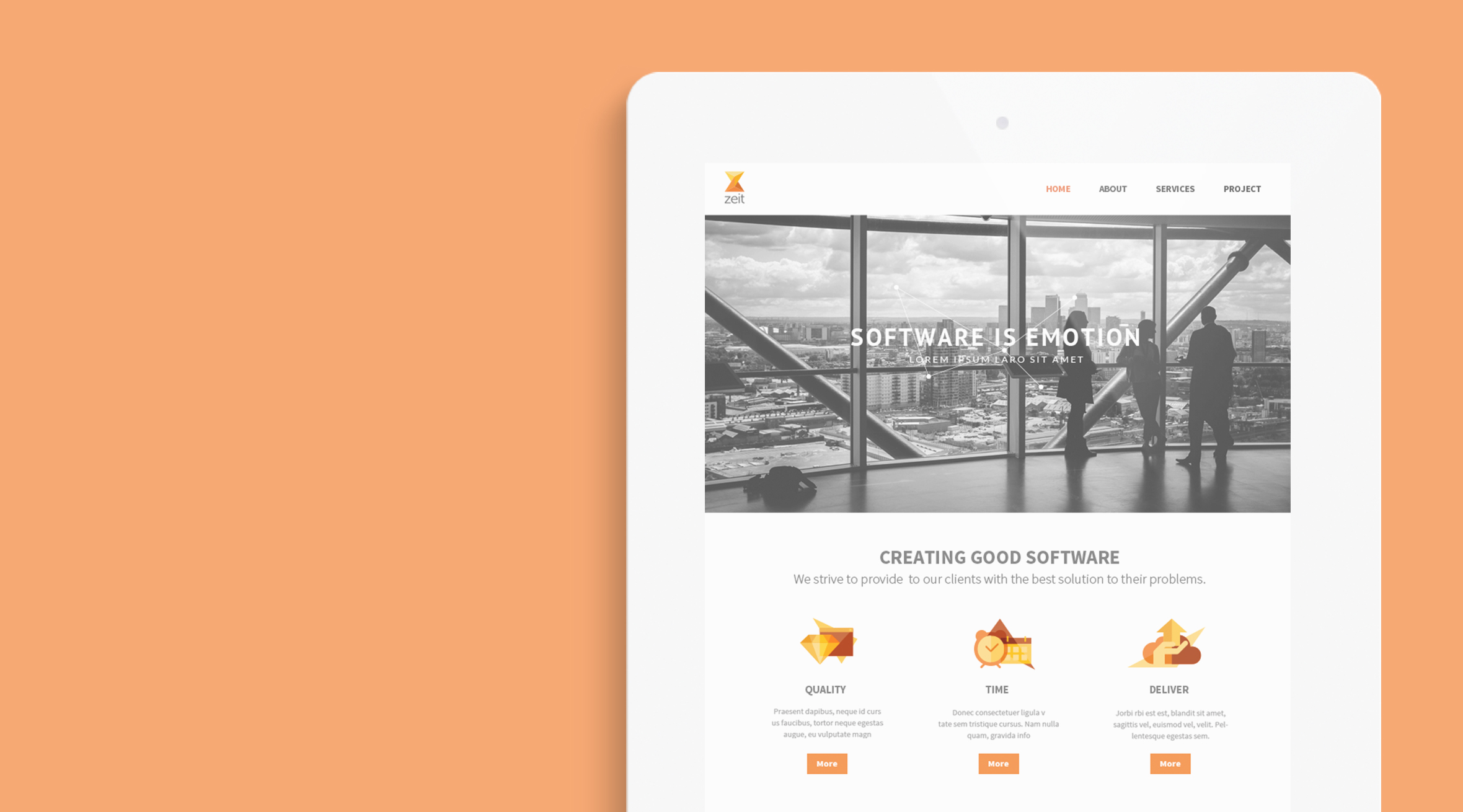
The supporting icons are composed by three elements: two illustration elements related to the idea behind the icon and one triangle shape extracted from the Zeit logo that can be adapted in color and size to suit the purpose of each icon.
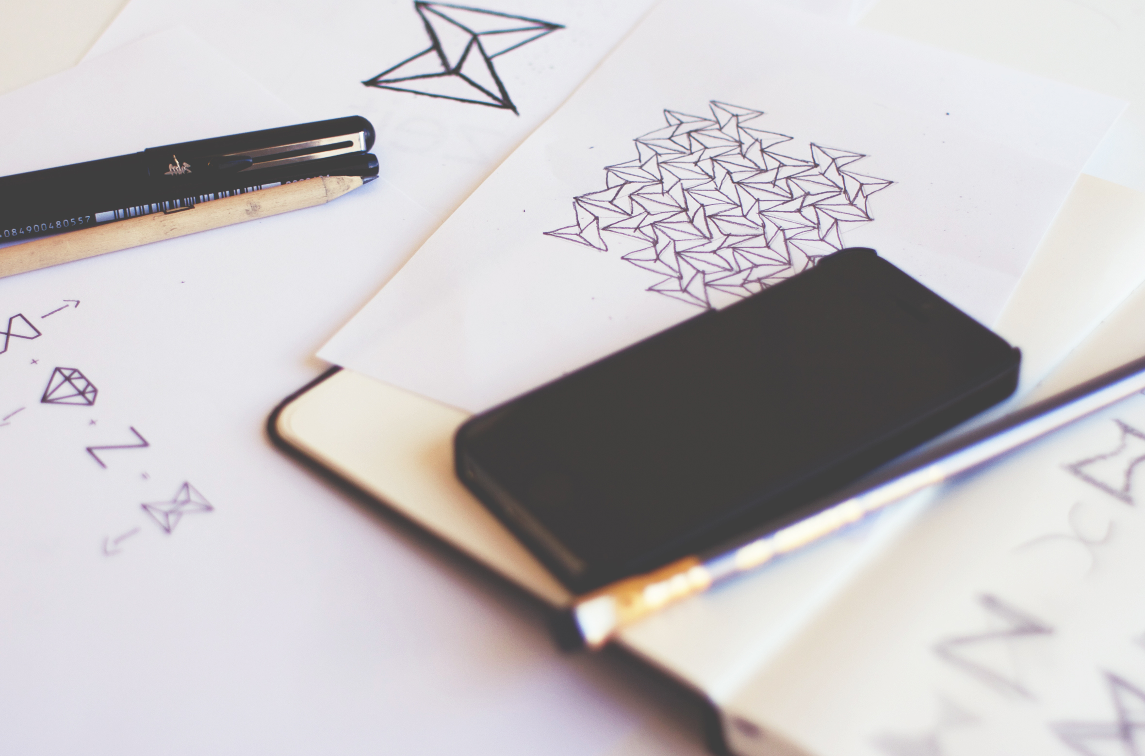
I also designed a pattern that is formed with an outline of the symbol, to make a grid-like structure, this concept ties back to the one of the ideas in the brief that argued that the development work is what holds everything together.