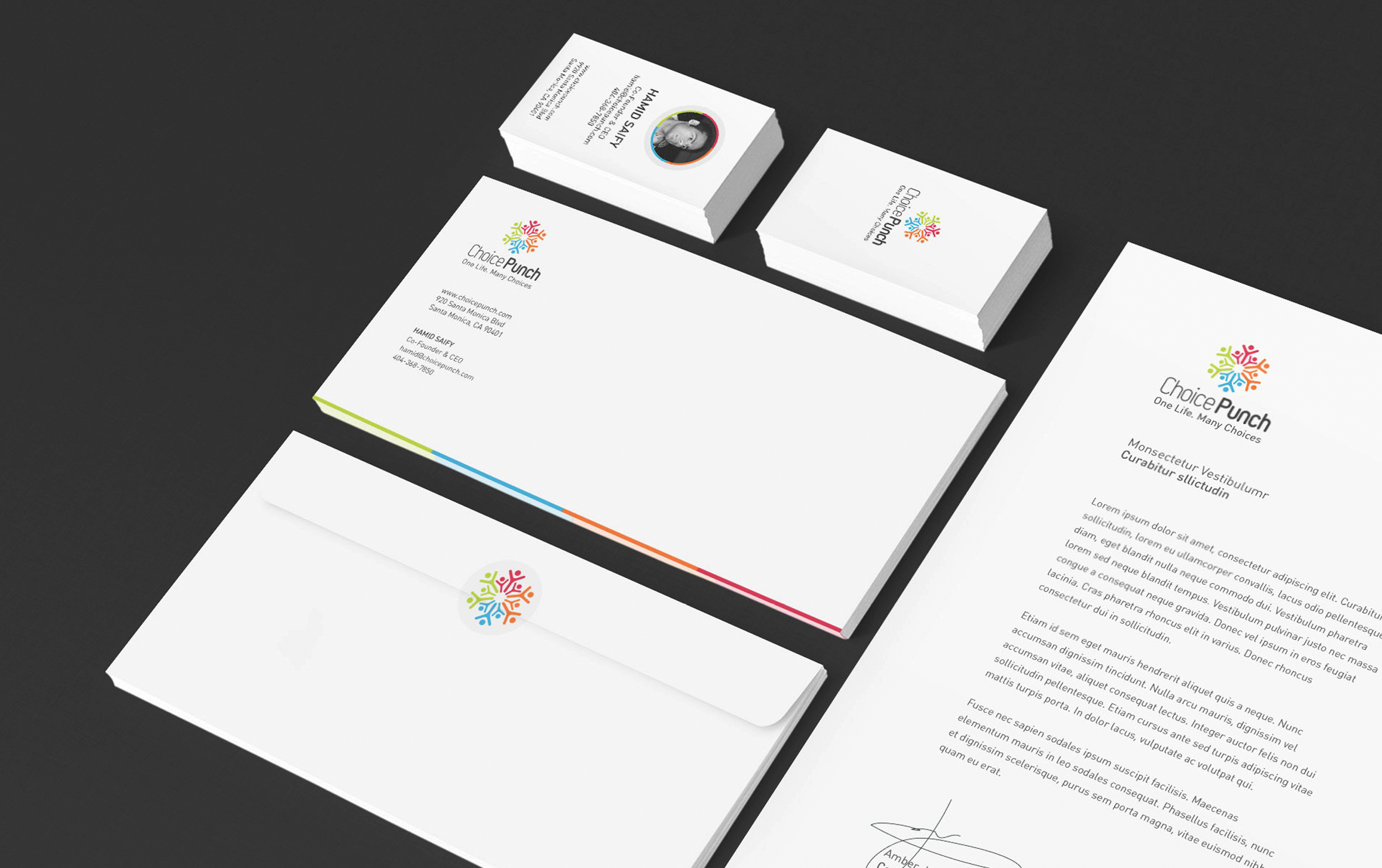
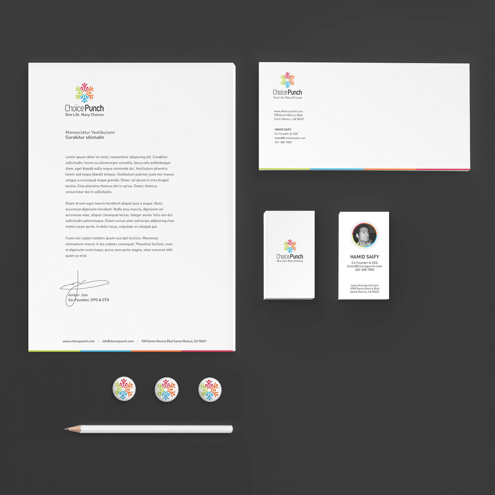
Choice Punch visual identity and website
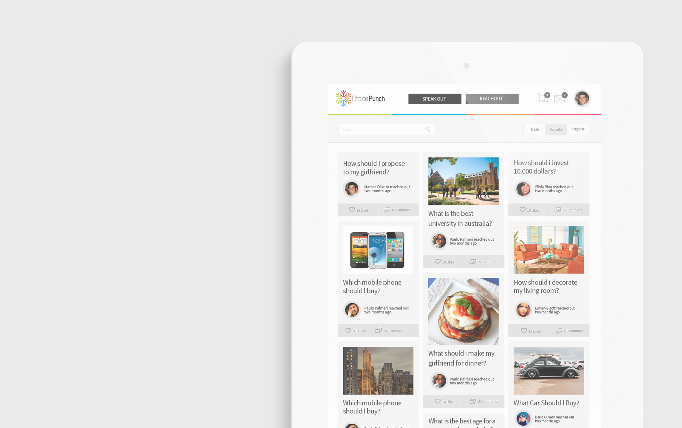
ChoicePunch is a startup based in Los Angeles that wants to reinvent the way people make choices by cutting out information overload & giving them one central source to make real life decisions.
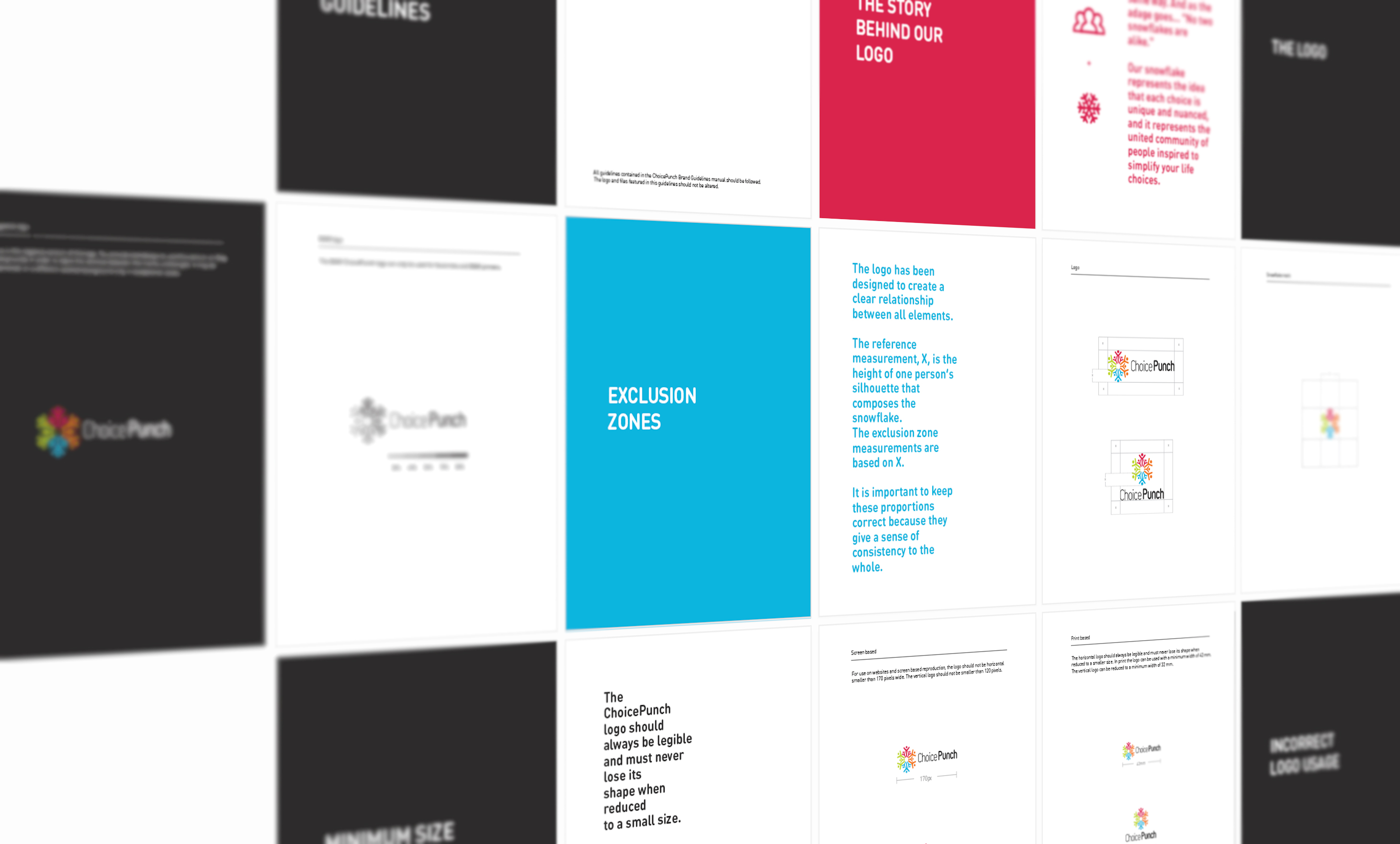
Initially the founders contacted me for a logotype but given the success we had in the process I ended up designing also all their interfaces.The design process started with a simple branding questionnaire to understand better the company, what was its mission and what we wanted to convey with the new branding. One of the answers to the questionnaire that I particularly liked was “Every choice is unique. No two people face a life problem in the same way.” So inspired by that insight I started to iterate through different shapes and finally settled on using a symbol that resembles a snowflake, as the adage goes… “No two snowflakes are alike.”
The snowflake represents the idea that each choice is unique and nuanced, at the same time the symbol represents the community aspect of the platform.